


Table of Contents Show
Color plays a significant role in our lives, influencing our emotions, perceptions, and preferences.
In the world of design, understanding the art of color coordination is essential to creating visually appealing and harmonious compositions.
One color that stands out for its versatility and timeless appeal is blue. From serene oceanic hues to vibrant electric shades, blue offers a wide range of possibilities for design enthusiasts and professionals alike.
In this comprehensive blog post, we will embark on a journey exploring the captivating world of colors, with a particular focus on how blue blends harmoniously with other hues.
Whether you’re an interior designer looking to create a serene living space, a fashionista seeking stylish clothing combinations, or a marketer aiming to evoke specific emotions in your audience, understanding which colors go well with blue is crucial for achieving your desired aesthetic.
But before we dive into the enchanting realm of blue color combinations, let’s take a moment to understand the basics of color theory and the significance of the color wheel.

Understanding the Color Wheel
The color wheel is a fundamental tool that helps us comprehend how colors interact and relate to one another.
It consists of primary, secondary, and tertiary colors arranged in a circular format.
By understanding the principles of the color wheel, designers can make informed choices when it comes to color combinations.
Primary colors, including red, blue, and yellow, are the building blocks of all other colors.
Secondary colors, such as orange, green, and purple, are created by mixing two primary colors together.
Lastly, tertiary colors are formed by mixing one primary color with one adjacent secondary color on the color wheel.
Within this color wheel framework, certain color combinations hold particular significance.
Complementary colors, for instance, are situated directly opposite each other on the wheel and offer a striking contrast when used together.
Analogous colors, on the other hand, are adjacent to each other and provide a harmonious and soothing effect.
Triadic colors, as the name suggests, form a triangle on the color wheel and offer a vibrant and balanced combination.
The Versatility of Blue Color Combinations
Now, let’s turn our attention to the color blue.
Blue is a versatile hue that can evoke a range of emotions and atmospheres depending on the specific shade and its accompanying colors.
From the calming effect of light blues to the bold impact of deep navy, blue offers endless possibilities for creating captivating designs.

When exploring blue color combinations, one popular approach is to consider complementary colors.
Complementary colors are those that sit opposite each other on the color wheel, creating a visually striking contrast. For blue, one complementary color is orange.
The energetic warmth of orange can beautifully balance the coolness of blue, creating a dynamic and eye-catching combination.
Another complementary color for blue is yellow, which adds vibrancy and cheerfulness to any design.
Coral, a shade that blends pink and orange undertones, can also complement blue, infusing warmth and elegance into the overall composition.
Analogous colors, those that are adjacent to blue on the color wheel, offer a more harmonious and calming effect.
Blue-green, for example, combines the tranquility of blue with the freshness of green, resulting in a serene and balanced ambiance.
Blue-purple, on the other hand, adds depth and richness to a design, creating a sense of sophistication. Blue-gray, a combination of blue and gray, lends a modern and minimalist touch to any composition, exuding a sense of sophistication and timelessness.
Triadic colors provide a vibrant and balanced combination by forming a triangle on the color wheel with blue.
For instance, pairing blue with red and yellow creates a striking balance between warmth and coolness.
This combination can be ideal for designs that aim to evoke energy and playfulness.
Green and orange, when combined with blue, offer a fresh and vibrant composition.
Purple and yellow-green, on the other hand, embrace creativity and energy, making for a visually captivating design.
As we explore the wonderful world of blue color combinations, it’s essential to delve deeper into the psychological and cultural associations that this color holds.
Understanding the impact of blue on our emotions and the symbolism it carries in different contexts can significantly enhance our design choices.
Note: The content provided above is an example of an in-depth introduction for the blog post and does not encompass the entirety of the introduction section.
Understanding the Color Wheel
The color wheel serves as a foundation for understanding color combinations and their visual impact.
By studying the color wheel, designers can make informed decisions about which colors work harmoniously together.
Let’s take a closer look at the key components and concepts within the color wheel.
Primary, Secondary, and Tertiary Colors
At the core of the color wheel are the primary colors: red, blue, and yellow.
These colors cannot be created by mixing other colors together and are considered the building blocks of all other hues. Primary colors have a profound influence on color theory and provide a basis for understanding color relationships.
Secondary colors are created by combining two primary colors.
The secondary colors include orange (red + yellow), green (yellow + blue), and purple (blue + red).
These colors offer a more diverse palette and can be combined in various ways with primary and tertiary colors.
Tertiary colors are formed by blending one primary color with one adjacent secondary color on the color wheel.
For example, red-orange, yellow-green, blue-green, blue-violet, red-violet, and yellow-orange are all tertiary colors.
These colors provide even more nuance and subtlety to color combinations, allowing for greater creativity and complexity in design.
Complementary Colors and Their Impact on Design
Complementary colors are positioned directly opposite each other on the color wheel.
When used together, they create a visually striking contrast that can be both dynamic and harmonious.
Understanding complementary colors is essential for achieving balance and visual interest in design.
Blue has several complementary colors that can be paired with it to create captivating combinations.
One of these complementary colors is orange, which sits opposite blue on the color wheel.
The energetic warmth of orange beautifully balances the coolness of blue, creating a visually striking and eye-catching contrast.
This combination can be used to grab attention and create a sense of vibrancy in design.
Another complementary color for blue is yellow.
Yellow and blue are often associated with sunshine and the sky, showcasing a natural and harmonious relationship.
Combining these two colors can evoke feelings of cheerfulness and brightness.
The vibrant nature of yellow adds a lively touch to the calming properties of blue, resulting in a well-rounded composition.
Coral, a shade that blends pink and orange undertones, is also considered complementary to blue.
This combination infuses warmth and elegance into a design.
Coral can be used as an accent color to add depth and interest, creating a visually appealing composition.
The Concept of Warm and Cool Colors
Understanding the concept of warm and cool colors is crucial for creating balanced and cohesive designs.
Warm colors, such as red, orange, and yellow, are associated with energy, excitement, and passion.
These colors tend to stand out and grab attention, making them ideal for focal points in a design.
On the other hand, cool colors, including blue, green, and purple, evoke calmness, serenity, and tranquility.
Cool colors have a soothing effect and can create a sense of relaxation in a design.
Blue, being a cool color, is often used to create a peaceful and serene ambiance in various settings.
By incorporating warm and cool colors in a design, designers can manipulate the mood and atmosphere they want to convey.
The interplay between warm and cool colors can create a sense of balance and harmony, resulting in visually pleasing compositions.
Understanding the fundamentals of the color wheel, complementary colors, and the concept of warm and cool colors provides a solid foundation for exploring the various color combinations that work well with blue.
By delving deeper into these concepts, we can unlock the potential of blue as a versatile and captivating color that can be seamlessly integrated into any design.
Blue Color Combinations
Blue, with its wide range of shades and tones, offers endless possibilities for creating captivating color combinations.
Whether you’re aiming for a calming and serene ambiance or a bold and vibrant statement, blue can be paired with various colors to achieve the desired effect.
Let’s explore some of the most popular and visually appealing blue color combinations.
Complementary Colors:
Orange: Exploring the Energetic Contrast
One of the most striking and energetic combinations with blue is orange.
As complementary colors, blue and orange create a visual contrast that demands attention.
The coolness of blue perfectly balances the warmth and vibrancy of orange, resulting in a dynamic and eye-catching composition.
In design, this combination can be used to evoke a sense of energy and excitement.
For instance, in a living room, blue walls can be complemented with orange accents such as throw pillows, rugs, or artwork.
The juxtaposition of these colors will create a lively and inviting space.
Similarly, in branding and marketing materials, incorporating blue and orange can help draw attention, convey enthusiasm, and leave a memorable impression on the audience.
Yellow: Creating a Vibrant and Cheerful Ambiance
Another complementary color for blue is yellow.
This combination offers a vibrant and cheerful ambiance, reminiscent of sunny skies and blooming flowers.
Pairing blue with yellow can create a sense of optimism and happiness in a design.
When used in interior design, blue and yellow can transform a space into a lively and inviting area.
For example, a blue and yellow color scheme in a kitchen can create a fresh and cheerful atmosphere.
Blue cabinets and yellow accents, such as curtains or kitchen utensils, can add a playful and energetic touch to the overall design.
In fashion, blue and yellow can be combined to create stylish and eye-catching outfits.
A blue dress paired with yellow accessories or vice versa can make a bold fashion statement, exuding confidence and individuality.
Coral: Infusing Warmth and Elegance
Coral, a shade that blends pink and orange undertones, complements blue beautifully.
This combination infuses warmth and elegance into a design, offering a sophisticated and harmonious composition.
In interior design, blue and coral can be used to create a serene and refined space.
For instance, a bedroom adorned with blue walls and coral accents, such as bedding or decorative pillows, can create a relaxing and luxurious atmosphere.
The combination of these colors evokes a sense of tranquility and adds a touch of opulence to the room.
In the realm of fashion, blue and coral can be combined to create stunning and fashionable outfits.
Whether it’s a blue suit with a coral tie or a coral dress with blue accessories, this combination exudes sophistication and style.
By exploring these complementary color combinations, designers can unlock the potential of blue and create visually captivating compositions.
The energetic contrast of blue with orange, the vibrant cheerfulness of blue with yellow, and the warmth and elegance of blue with coral showcase the versatility and impact of blue color combinations.
Analogous Colors
Analogous colors are colors that are adjacent to each other on the color wheel.
When used together, they create a harmonious and pleasing effect, making them a popular choice for creating balanced and cohesive designs.
When it comes to blue, there are several analogous colors that work exceptionally well in combination.
Blue-Green: Achieving a Harmonious and Calming Effect
Blue-green is a beautiful combination that blends the tranquility of blue with the freshness of green.
This analogous color pairing creates a serene and balanced ambiance, reminiscent of lush landscapes and calming waters.
In interior design, blue-green can be used to create a peaceful and relaxing atmosphere.
A bedroom decorated with blue-green walls, complemented by natural elements such as wooden furniture and leafy green plants, can evoke a sense of tranquility and serenity.
This combination is also ideal for spa-like bathrooms, where the soothing colors can enhance relaxation.
In fashion, blue-green can be incorporated into outfits to create a sense of calm and sophistication.
Whether it’s a blue-green dress paired with neutral accessories or a blue-green blouse with green trousers, this combination exudes a sense of harmony and elegance.
Blue-Purple: Adding Depth and Richness
Blue-purple, also known as indigo, is a captivating combination that adds depth and richness to any design.
This analogous color pairing creates a sense of mystery and sophistication, offering a visually striking and unique composition.
In interior design, blue-purple can be used to create a dramatic and luxurious ambiance.
A living room adorned with blue-purple walls, paired with metallic accents and plush furniture, creates a space that exudes opulence and elegance.
This color combination is also popular in bedrooms, where it can create a sense of intimacy and coziness.
In fashion, blue-purple can be incorporated into outfits to make a bold and fashion-forward statement.
Whether it’s a blue-purple dress paired with silver accessories or a blue-purple blazer with black pants, this combination is sure to turn heads and showcase individuality.
Creating a Sophisticated and Modern Look
Blue-gray is a combination that exudes sophistication and modernity.
This analogous pairing creates a sleek and timeless aesthetic, making it a popular choice in contemporary design.
In interior design, blue-gray can be used to create a clean and minimalist atmosphere.
The combination of blue-gray walls with white furniture and accents creates a space that is both calming and stylish.
This color pairing is often used in modern kitchens and bathrooms, where it adds a touch of elegance and simplicity.
In fashion, blue-gray can be incorporated into outfits to create a chic and refined look.
Whether it’s a blue-gray suit paired with a white shirt or a blue-gray sweater with black jeans, this combination offers a sense of understated elegance and sophistication.
By exploring these analogous color combinations, designers can leverage the harmonious and balanced effects of blue-green, blue-purple, and blue-gray.
Whether creating a serene and calming space or aiming for a sophisticated and modern look, these combinations allow for endless creativity and visual appeal.
Triadic Colors
Triadic colors are a group of three colors that are evenly spaced around the color wheel, forming an equilateral triangle.
This color combination offers a balanced and vibrant composition, creating a visually captivating and harmonious design.
When it comes to blue, there are several triadic color combinations that can be explored to achieve a striking and well-balanced aesthetic.
Red and Yellow: Striking a Balance Between Warmth and Coolness
Pairing blue with red and yellow creates a triadic color combination that strikes a balance between warmth and coolness.
Blue provides a cool and calming presence, while red and yellow inject energy and vibrancy into the composition.
In interior design, this triadic combination can be used to create a lively and dynamic space.
For example, a living room with blue walls can be complemented by red and yellow furniture or accessories.
The combination of these colors creates a visually stimulating environment, perfect for social gatherings and energetic conversations.
In fashion, the triadic combination of blue, red, and yellow can be incorporated into outfits to create a bold and attention-grabbing look.
Whether it’s a blue dress paired with red shoes and a yellow bag, or a yellow top with blue jeans and a red jacket, this combination showcases a sense of confidence and individuality.
Green and Orange: Combining Freshness and Vibrancy
Combining blue with green and orange creates a triadic color combination that combines freshness and vibrancy.
Blue provides a cool and calming backdrop, while green and orange inject a sense of liveliness and energy into the design.
In interior design, this triadic combination can be used to create a refreshing and invigorating space.
For instance, a bedroom with blue walls can be accented with green and orange bedding or decor.
The combination of these colors creates a harmonious and nature-inspired atmosphere, promoting relaxation and rejuvenation.
In fashion, the triadic combination of blue, green, and orange can be incorporated into outfits to create a unique and eye-catching look.
Whether it’s a green top paired with blue jeans and orange accessories, or an orange dress with blue-green earrings, this combination exudes a sense of creativity and playfulness.
Purple and Yellow-Green: Embracing Creativity and Energy
Pairing blue with purple and yellow-green creates a triadic color combination that embraces creativity and energy.
Blue provides a cool and calming element, while purple and yellow-green inject a sense of vibrancy and excitement into the design.
In interior design, this triadic combination can be used to create a visually captivating and stimulating space.
For example, a home office with blue walls can be enhanced with purple and yellow-green accents, such as artwork or accessories.
This combination creates an atmosphere that promotes focus and creativity.
In fashion, the triadic combination of blue, purple, and yellow-green can be incorporated into outfits to create a bold and artistic look.
Whether it’s a purple dress paired with blue shoes and yellow-green earrings, or a yellow-green blouse with blue pants and a purple handbag, this combination showcases a sense of individuality and expression.
By exploring these triadic color combinations, designers can create visually captivating and well-balanced compositions.
Whether aiming for a balance between warmth and coolness with red and yellow, combining freshness and vibrancy with green and orange, or embracing creativity and energy with purple and yellow-green, triadic color combinations offer endless possibilities for captivating designs.
Psychological and Cultural Associations
Colors have a profound impact on our emotions and can evoke specific psychological responses.
Blue, in particular, has significant psychological associations that vary depending on shade and context.
Understanding these psychological associations is crucial when incorporating blue into design choices.
Additionally, different cultures attribute various meanings and symbolism to the color blue, adding another layer of complexity to its interpretation.
Let’s explore the psychological and cultural associations of the color blue.
Psychological Impact of Blue
Blue is often associated with feelings of calmness, tranquility, and serenity.
It has a soothing effect on the mind and can promote a sense of relaxation and peace.
This psychological impact of blue makes it a popular choice for spaces where a sense of calmness and tranquility is desired, such as bedrooms, meditation rooms, or spa environments.
Beyond its calming properties, blue is also associated with trust, loyalty, and stability.
It conveys a sense of reliability and responsibility, making it a suitable color for businesses and organizations that aim to instill trust in their customers.
The psychological impact of blue can be harnessed in branding and marketing strategies to create a sense of professionalism and dependability.
Another psychological association of blue is its ability to stimulate creativity and productivity.
Research suggests that blue can enhance cognitive performance and stimulate the imagination.
This makes blue an excellent choice for creative workspaces or areas where focus and productivity are desired, such as offices or studios.
Cultural Symbolism of Blue
The symbolism and cultural associations of blue vary across different societies and traditions.
In Western cultures, blue is commonly associated with peace, tranquility, and harmony.
It is often used to create a calming atmosphere or convey a sense of reliability and trustworthiness.
Blue is also associated with feelings of serenity and spirituality, making it a popular color choice for religious settings.
In contrast, Eastern cultures attribute different meanings to the color blue.
In many East Asian cultures, blue has a strong association with immortality, eternity, and transcendence.
It is often used in artwork and symbolism to represent spiritual enlightenment and divine presence.
Religious contexts also provide additional cultural symbolism for the color blue.
In Christianity, blue is associated with the Virgin Mary and is often used to represent purity, grace, and divinity.
In Hinduism, blue is associated with the god Krishna and represents divine love, joy, and compassion.
Understanding the cultural symbolism of blue is essential when designing for a global audience or incorporating blue into branding and marketing strategies.
Cultural nuances and interpretations can significantly impact the perception and reception of a design or message.
By considering the psychological impact and cultural symbolism of blue, designers can make informed choices about its use in various contexts.
Whether aiming to create a calming and serene environment, evoke trust and reliability, stimulate creativity, or incorporate cultural symbolism, the psychological and cultural associations of blue play a crucial role in effective design.
Practical Applications and Design Tips
Now that we have explored the various color combinations and associations of blue, let’s delve into the practical applications and design tips for incorporating blue into different aspects of our lives, including interior design, fashion, and branding and marketing.
Blue in Interior Design
Blue is a versatile color that can be used in various ways to create different atmospheres within interior spaces.
Here are some practical applications and design tips for incorporating blue into different areas of your home:
1. Bedroom: Blue is often associated with calmness and relaxation, making it an excellent choice for a bedroom. Lighter shades of blue, such as sky blue or baby blue, can create a serene and peaceful atmosphere, facilitating a good night’s sleep. Consider using blue bedding, curtains, or accent pillows to infuse the space with a sense of tranquility.
2. Living Room: Blue can be used in the living room to enhance relaxation and social interaction. Consider using a combination of blue and complementary colors, such as orange or yellow, to create a vibrant and inviting space. Incorporate blue through the choice of furniture, rugs, or artwork, striking a balance between coolness and warmth.
3. Kitchen: Blue can be a refreshing and stylish choice for the kitchen. Lighter shades of blue, such as aqua or turquoise, can create a fresh and clean ambiance. Consider using blue for cabinets, backsplashes, or even kitchen appliances to add a touch of elegance and freshness to the space.
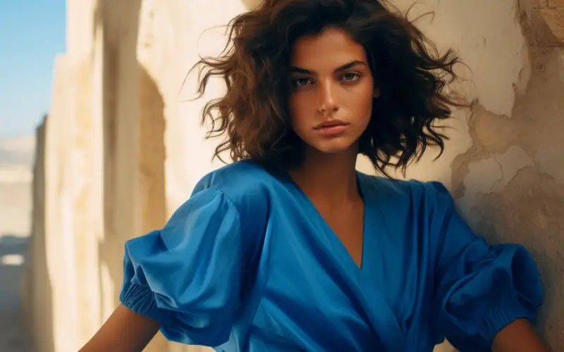
Blue in Fashion and Personal Style
Incorporating blue into your personal style can add depth and versatility to your outfits. Here are some fashion tips for using blue in your wardrobe:
1. Choosing the Right Shade: Blue comes in various shades and tones, so it’s crucial to choose the right shade that complements your skin tone. For cool undertones, opt for shades like royal blue or navy. If you have warm undertones, consider shades like turquoise or teal. Experiment with different shades to find the ones that enhance your natural features.
2. Pairing with Complementary Colors: Blue can be paired with complementary colors to create stylish and eye-catching outfits. For example, pair a blue blouse with orange pants or a blue dress with yellow accessories. This combination creates a visually striking contrast that exudes confidence and individuality.
3. Accessories and Accents: Blue accessories can add a pop of color and sophistication to your overall look. Consider incorporating blue through statement jewelry, scarves, handbags, or shoes. Blue accents can elevate a neutral outfit and provide a focal point for your ensemble.
Blue in Branding and Marketing
The color blue holds significant importance in branding and marketing.
Here are some ways to effectively use blue in your branding and marketing strategies:
1. Blue in Logo Design: Blue is often associated with trustworthiness, reliability, and professionalism. Incorporating blue into your logo design can help convey these qualities to your audience. Whether it’s a corporate logo or a brand logo, consider using shades of blue that align with your brand identity and values.
2. Using Blue in Advertisements: Blue can be used strategically in advertisements to evoke specific emotions and associations. For example, using blue in advertisements for financial institutions can convey a sense of trust and stability. In contrast, using blue in advertisements for travel or leisure can evoke a sense of calmness and relaxation.
3. Cultural Considerations: When using blue in global marketing campaigns, it’s essential to consider cultural associations and interpretations. As we explored earlier, the cultural symbolism of blue can vary across different societies and traditions. Ensure that your use of blue aligns with the cultural context and resonates positively with your target audience.
By incorporating blue into interior design, fashion, and branding and marketing, we can harness its versatile and appealing qualities to create visually captivating and impactful designs.
Whether it’s creating a serene and peaceful atmosphere in your home, elevating your personal style, or effectively conveying trust and professionalism through branding and marketing, blue offers endless possibilities for creativity and expression.
Experts Take
In conclusion, the color blue offers a vast range of possibilities when it comes to color combinations and design.
Understanding how blue can be paired with other colors is essential for creating visually appealing and harmonious compositions.
Through complementary colors, such as orange and yellow, blue can create energetic contrasts or vibrant and cheerful atmospheres.
Analogous colors like blue-green, blue-purple, and blue-gray offer harmonious and calming effects, adding depth and sophistication to designs.
Triadic color combinations, such as red and yellow or green and orange, provide balanced and vibrant compositions that evoke a sense of energy and creativity.
Beyond its visual appeal, blue carries psychological and cultural associations that can influence our emotions and perceptions.
Blue is often associated with calmness, trust, and productivity.
Its symbolism varies across different cultures, representing peace and spirituality in Western cultures and immortality and transcendence in Eastern cultures.
Understanding these psychological and cultural aspects of blue is crucial for effective design choices and global marketing strategies.
Practically, blue can be applied in various areas of our lives.
In interior design, blue can create serene bedrooms, inviting living rooms, and fresh kitchens. In fashion, blue can enhance personal style and add sophistication to outfits.
In branding and marketing, blue can convey trustworthiness and professionalism, while cultural considerations ensure its resonance with diverse audiences.
Incorporating blue into our designs and daily lives opens up a world of possibilities.
Whether it’s creating a calming sanctuary, expressing personal style, or effectively communicating brand values, blue goes well with a wide range of colors and offers endless opportunities for creativity and expression.
Remember, the key to successful design is experimentation and exploration.
So, embrace the versatility of blue and let your imagination soar as you discover the perfect color combinations that bring your vision to life.